Case Study
10 minute read
Overview
Blast Radius started as a physical card game, and the question of what a digital version could look like has been there since the beginning. Translating it to mobile isn't just a matter of putting cards on a screen. It means rethinking how strategy, turn-based mechanics, and multiplayer gameplay feel on a touchscreen, and how the app itself can reduce the friction of learning a new game. This case study documents the early design phase, from initial sticky noting and wireframes through to high-fidelity mockups, with development planned as the next step.
Role: UI design and product strategy (ongoing)
Scope: Design exploration · Development planned
Opportunity: Remove the learning barrier—let the app teach players as they play.
Impact: Establishing visual direction and translating core game mechanics into mobile UI.
Early Planning and Exploration
Before any screens were designed, the work started with feature brainstorming and user journey mapping. The goal was to figure out what an MVP actually needed to do and where the design effort should focus within a constrained timeline.
Feature prioritization came first. Multiplayer and gameplay hints emerged as high priority, with singleplayer and in-game chat sitting at medium. The reasoning was straightforward: Blast Radius is a social game at its core, and if the digital version couldn't teach players how to play without reading a rulebook, it wasn't solving the right problem.
The user journey was mapped across three phases. Prior to gameplay covered registration, the landing page, learning the game, session creation, and joining a session. During gameplay focused entirely on the in-game screen, where players would spend the majority of their time. Post-gameplay included game stats, the ability to play again, and inviting friends.
That planning set clear boundaries. The in-game screen became the primary design focus, with the landing page and health state mechanics as foundational pieces that had to work before anything else could.
Wireframes &
Compositional Exploration
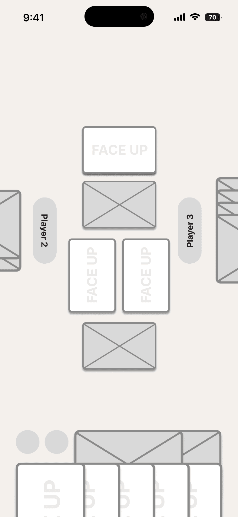
Before committing to high-fidelity mockups, wireframes were used to solve the core spatial challenge: fitting cards of various types, player-specific UI elements, and dynamic player positions on a single screen. The game supports 3 to 6 players, meaning the layout had to adapt without breaking as player count changed.
The wireframes focused on figuring out how other players' information should be displayed depending on the number of participants. Each player needed to see their own cards and status clearly while still being able to track opponents' positions, health states, and available actions. The compositional solutions that emerged from the wireframes carried directly into the final mockups, validating that the spatial logic worked before visual design was applied.
3, 4, 5, and 6-player layout from left to right respectively
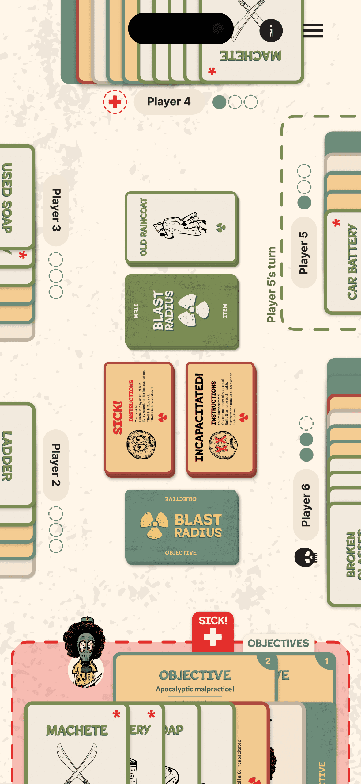
Information Card UI Design
The game uses collapsible info cards to surface critical information without overwhelming the interface. Objective cards show player progress with filled circles for completed objectives and empty circles for remaining ones. Health status cards appear when a player becomes sick or incapacitated, making their condition immediately visible. A turn indicator card surfaces to signal when it's a player's turn, reducing confusion in multiplayer sessions.
The cards are always visible but collapsible, expandable on demand, and can stay open if a player needs continuous reference. They stack horizontally with overlap, following a defined order: item cards, medical cards, character card, and completed objective cards. The predictable structure keeps the interface organized even when multiple cards are present.
The expanded view of these cards is still being designed, with the challenge being how expansion affects the layout and whether other cards get displaced or remain accessible. That refinement is scoped as a next step before development begins.
Rolling to Recover
When a player is incapacitated, their turn begins with a mandatory die roll. The roll UI takes over the screen, showing the target number needed to recover alongside the result. Rolling too low keeps the player locked out for another round. Rolling the target number triggers a recovery state, returning the player to full participation. The sequence was designed to feel consequential — every roll carries stakes, and the visual feedback makes the outcome impossible to miss.
Final Insights
One of the most surprising outcomes so far has been how well the iconography and design elements from the physical game translated to digital. The visual language that worked on printed cards scaled naturally into a design system that feels cohesive across the app. There are still areas to refine, but the foundation feels solid.
The biggest unsolved design problem is player engagement during downtime. In a turn-based multiplayer game, keeping non-active players invested while someone else is taking their turn is critical. Should they be able to see the current player's hand? Does that break strategic planning and reduce tension? The answer isn't obvious yet, and finding the right balance between transparency and suspense will be one of the next challenges to tackle.
Looking back, there isn't much I'd do differently. The planning phase set clear boundaries, the wireframes solved the spatial problems early, and the high-fidelity mockups validated the direction. The work that's been done gives development a strong starting point, and the problems that remain are the right ones to be solving next.


